WhatTheFont
Font identification app for mobile and desktop
WhatTheFont is an instant font identification tool from MyFonts, the world’s largest font store. As designers, it’s common for us to see a great looking font in use, in print, or in an image, and have no idea what it is. And unless you happen to have a designer friend who’s great at knowing all the fonts you’re out of luck… unless you use an app like WhatTheFont.
WhatTheFont exists as a webapp and a mobile app. I designed the experiences for both and worked closely with the developers during implementation, including acting in an official Product Owner capacity for the mobile app.
Date
2017
Company
MyFonts
Industry
Designer productivity tool linked to ecommerce website
My Contributions
Visual Design
UI & UX Design
Product Ownership
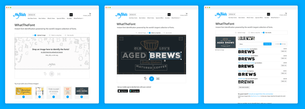
Demo of how the mobile app works
Screenshots of my design for WhatTheFont for iOS, released in October 2017. We also simultaneously released an Android version.

WhatTheFont1, aka the original WhatTheFont experience, 2009–2017. This is how the interface looked before I worked on it.
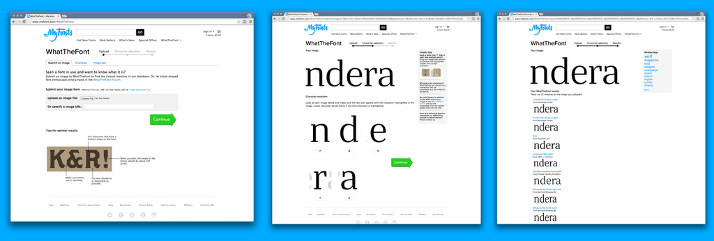
My design for WhatTheFont on the web, 2017.
At the time that we released this version in 2017, the user experience represented a cutting edge AI-powered search. As I write to update this page in 2025, it's practically an understatement to say that the field of AI has grown exponentially. I strongly suspect that if WhatTheFont was reworked today, the experience could be simplified even further.
My original concept for the UX was something like a two step process where the user would upload a photo, and the app would tell them what fonts were used in it, just like the way you’d be able to ask your smart designer friend to identify fonts for you. Sounds straightforward, right? Well, in practice, it turned out that that intended user flow was a little too good to be true.
In testing, we discovered that although it was technically possible for the font identification neural net to identify every piece of text in a complex image at once, doing so would cause too many API requests to the server which would slow the whole app down pretty badly. This technical limitation ended up affecting the final design of the app. My challenge was to create a user experience with just the right amount of friction, to balance technical needs with user needs while still keeping the experience as smooth as possible.
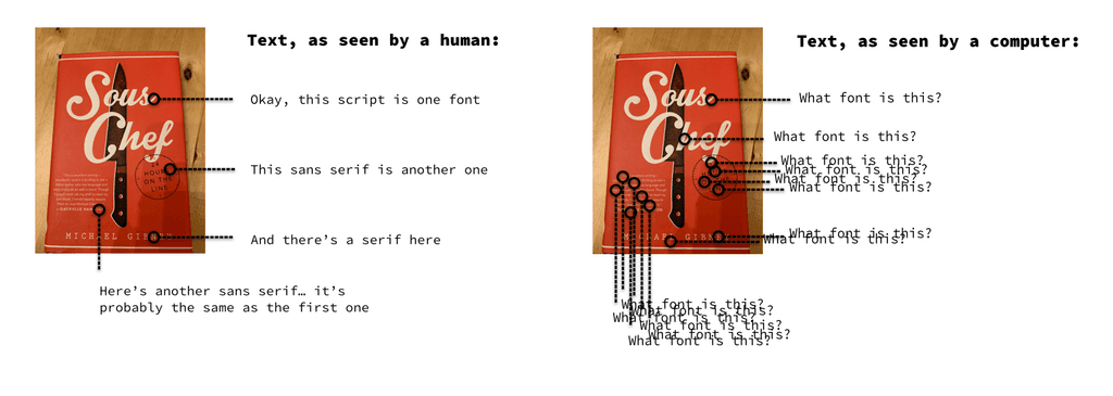
Computers don’t see text the same way we do. While a human may look at this image and intuitively know that each word in it is the same font, a computer looks at it and assumes that each word could be a different font and each one needs to be identified separately.
My solution for this was to have the user select a single piece of text they wanted to identify. I was originally concerned that the user would want to select all the text at once, but in usability testing I found that they easily adjusted to this workflow. We helped them out by pre-selecting one of the bits of text that we identified automatically. This worked quite well in practice and users were able to easily tap through to their font results.
At the end of the day, as user experience designers, it’s not enough to understand how the user would want to use the product, we also need to understand the benefits and limitations of the technologies we work with. I was lucky enough to work with a really engaged and passionate team who were excited to help me understand how the new technology they had built worked, and it was through this that I was able to come up with design solutions to meet the technical challenges.
